Stepping up to a better future
-
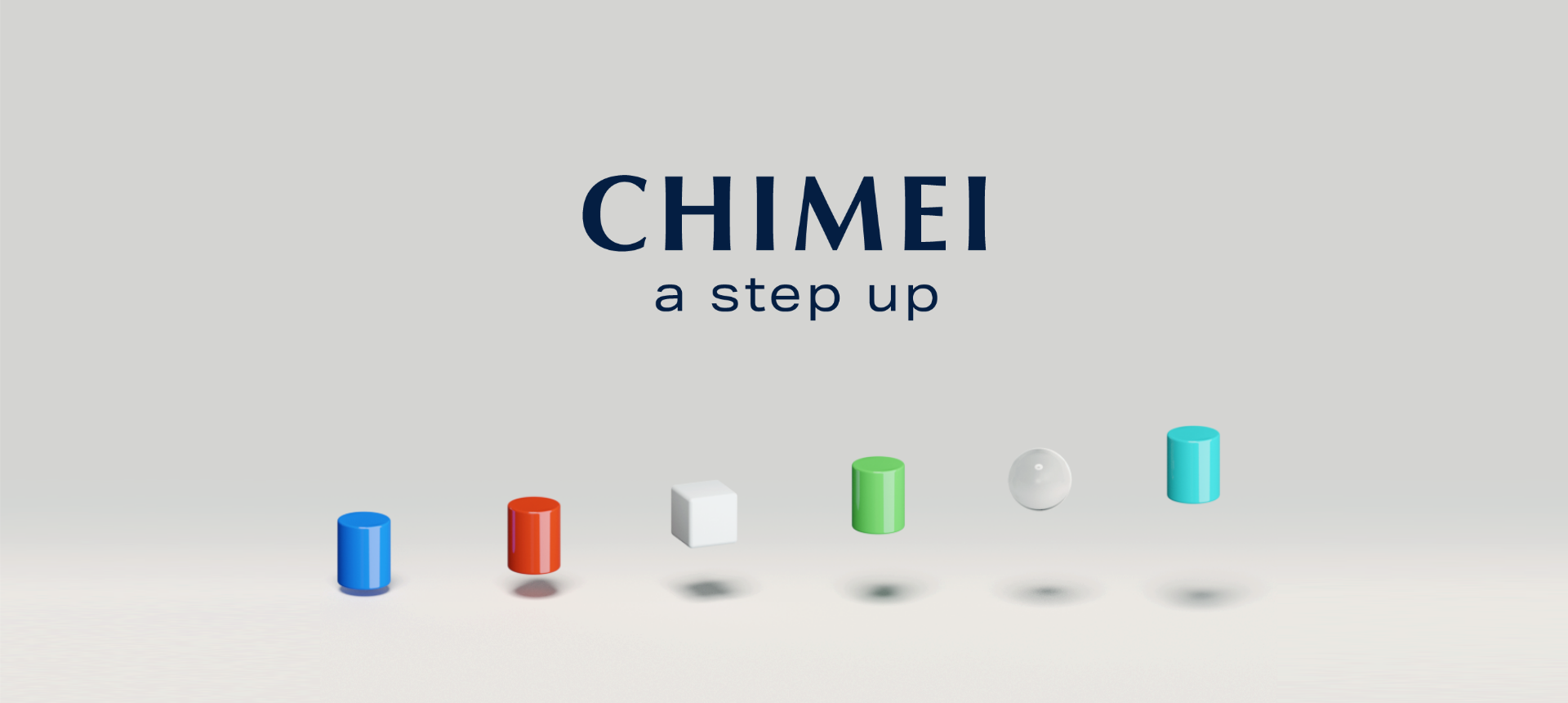
- CHIMEI
-
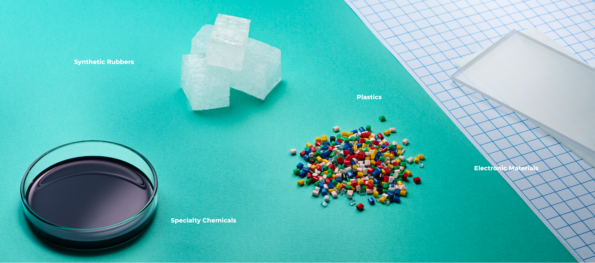
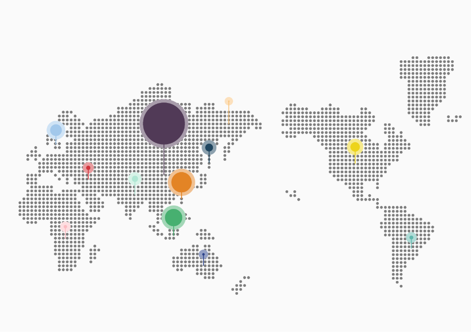
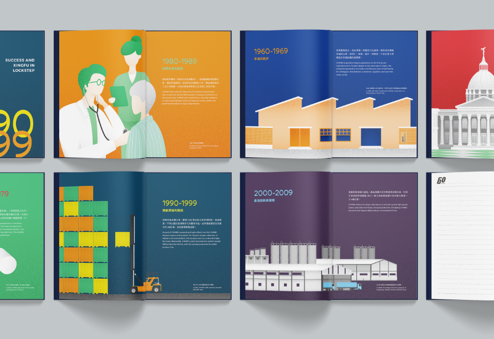
As the world's largest supplier of ABS resins, PMMA resins, and optical sheets, CHIMEI has achieved remarkable success in the market over the past 60 years. But, for a company as ambitious as CHIMEI, the story doesn’t end there. The performance materials company has even higher aspirations, and is determined to take its services and brand image to the next level.
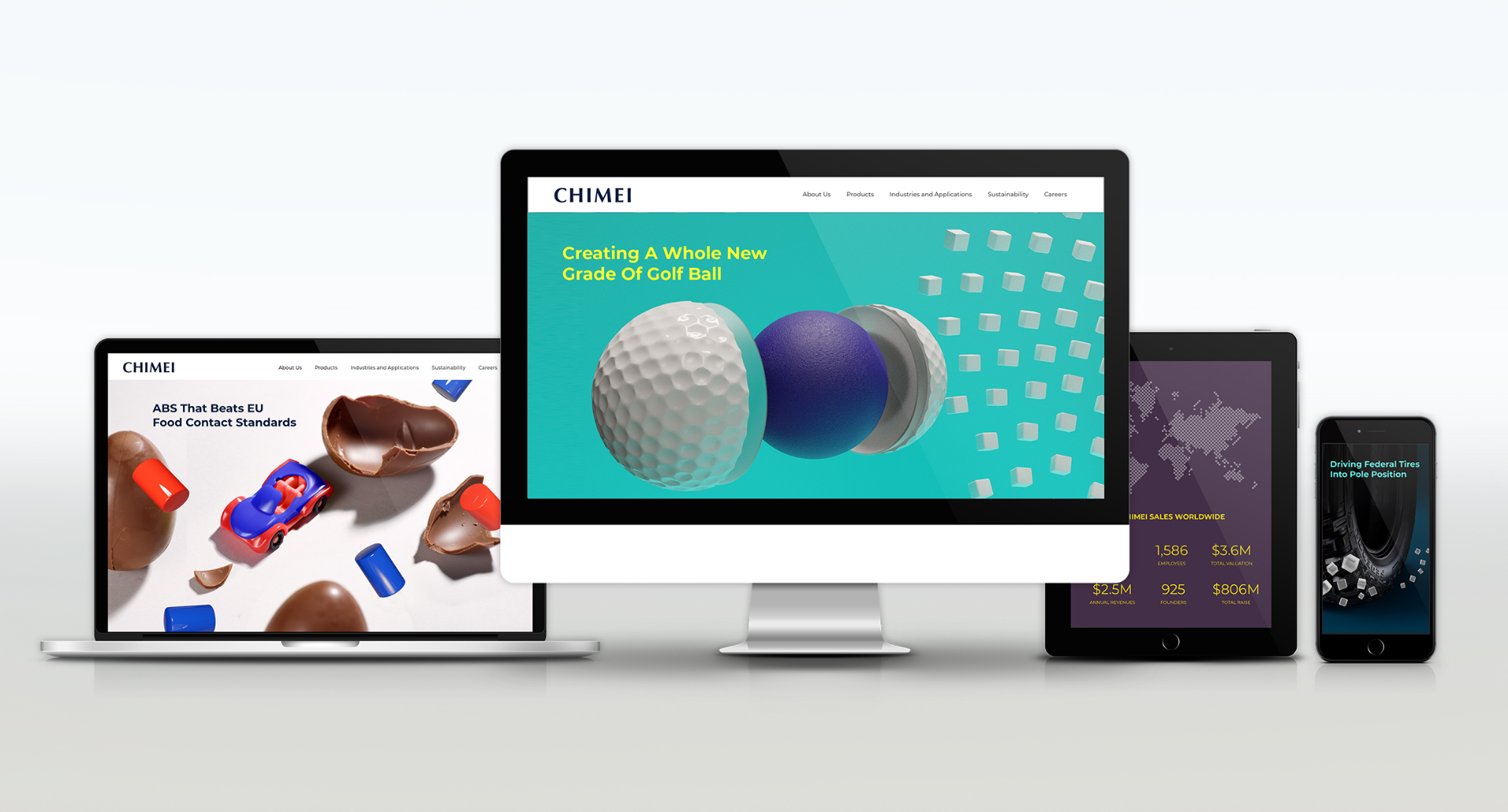
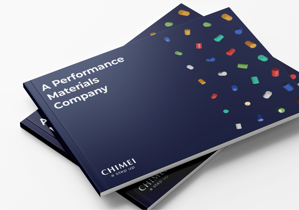
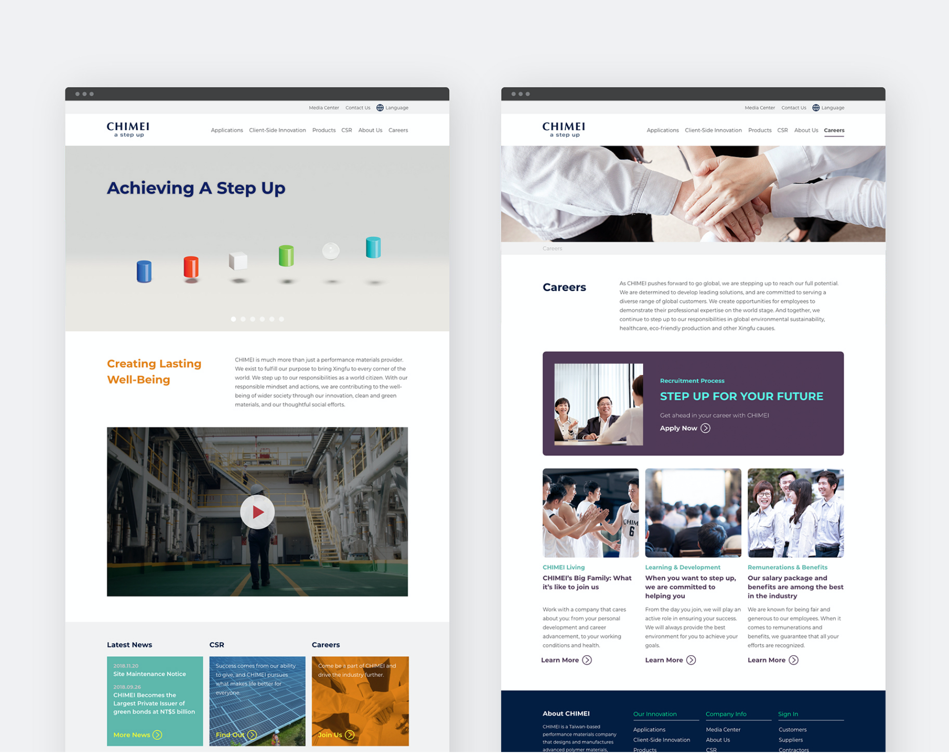
CHIMEI worked with DDG to develop a global-facing brand image. Our team created a clear strategy, precise communication messages, and a bold visual identity system—unveiling the company's capabilities and vitality.
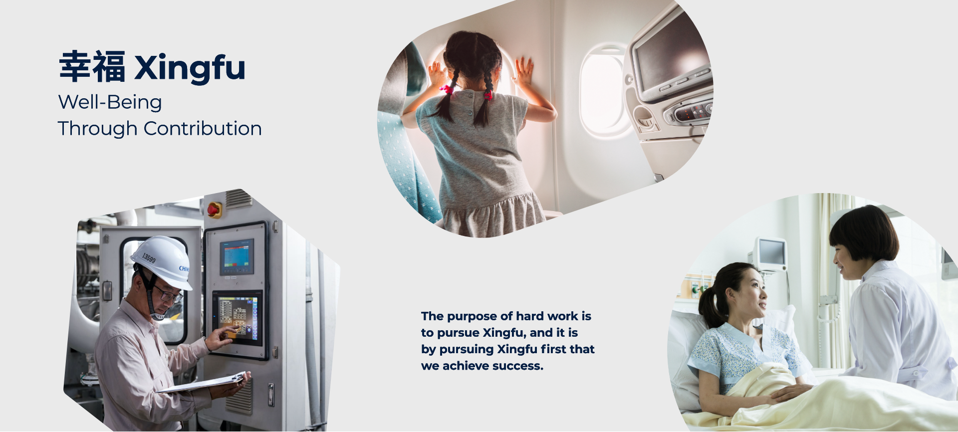
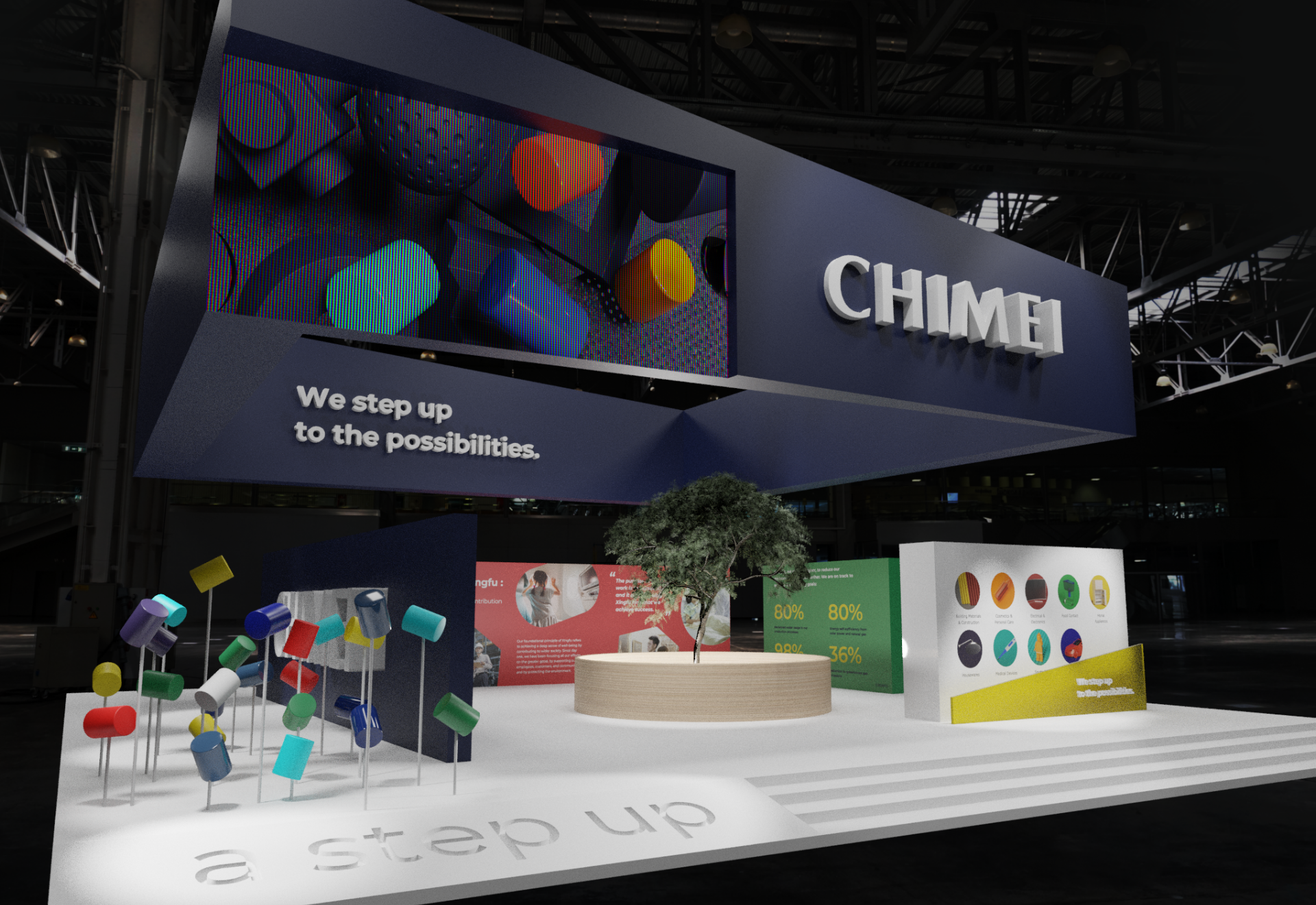
CHIMEI has always been driven by the concept of “Xingfu”, which broadly translates as achieving well-being through contribution. This principle drives the company to contribute meaningfully to its customers’ success, to environmental protection, and to wider society. CHIMEI worked with DDG to turn this idea of Xingfu into its Brand Catalyst® and to develop it further into the company’s new core concept - A Step Up.

-
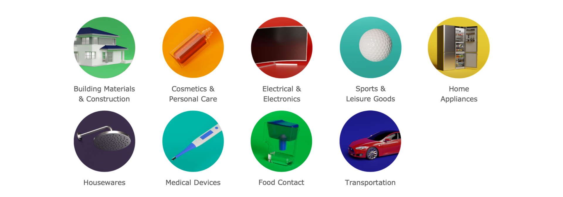
Establishing Differentiation
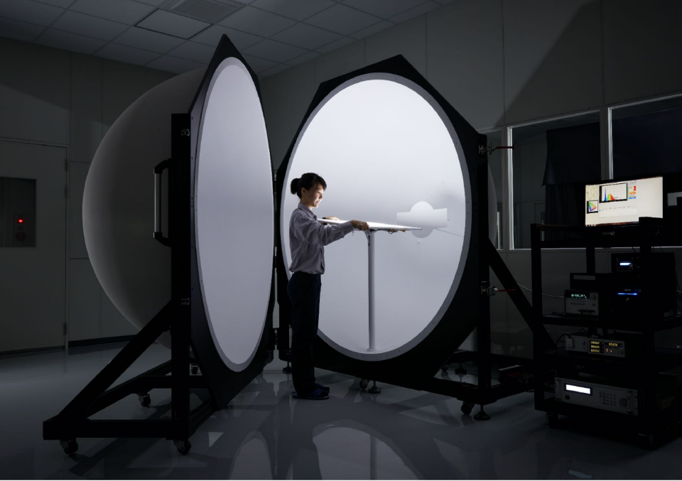
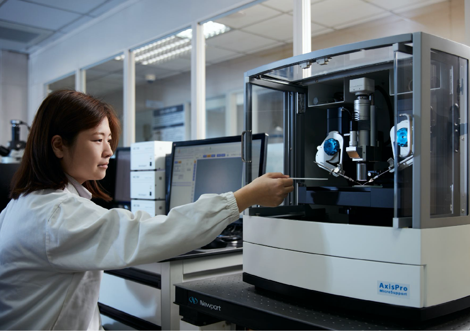
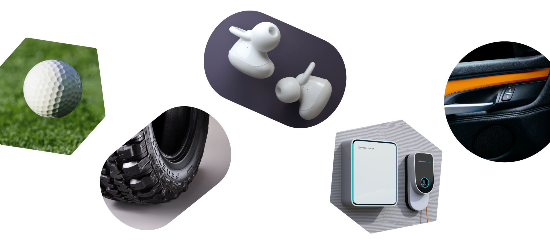
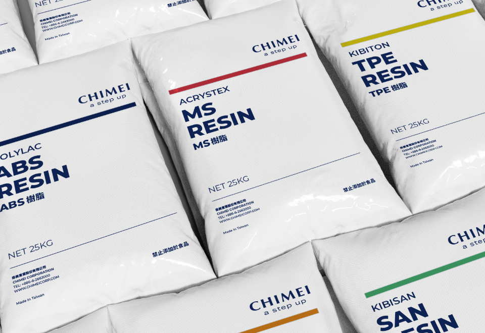
CHIMEI is deeply committed to, and has strong capabilities in, developing customized materials for its leading global customers. We coined the term Client-Side Innovation™ to reinforce this advantage. This new phrase provided the ideal way to frame the company's customer success stories, highlighting CHIMEI’s R&D capabilities and achievements.
-
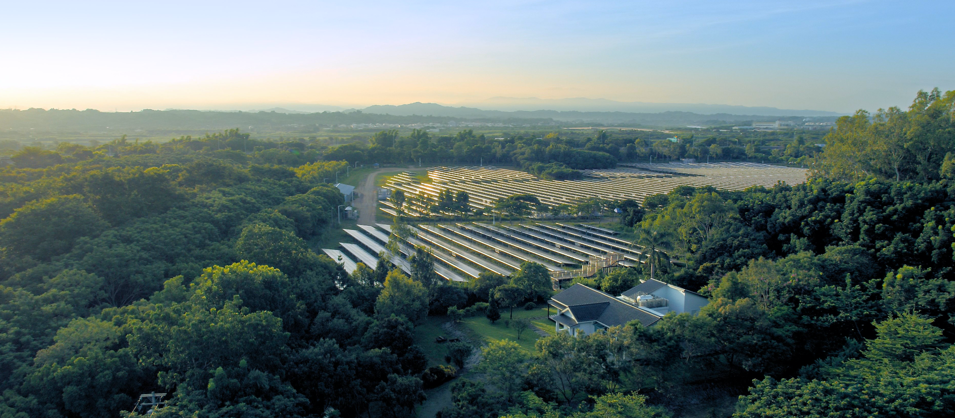
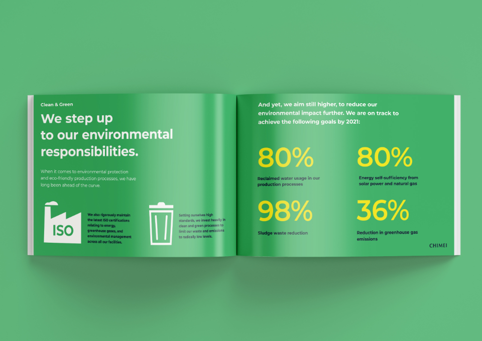
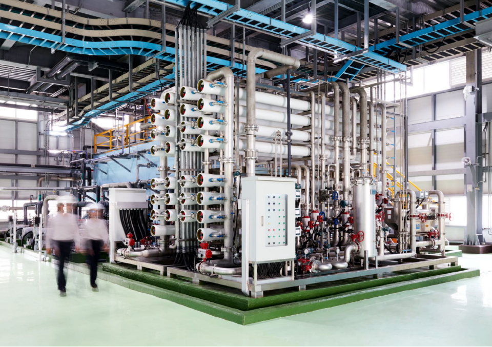
At the same time, CHIMEI has long been devoted to environmental protection and green energy investment. With the opportunity presented by the rebrand, it was time to let the world know. We recommended highlighting these efforts at the brand level, leveraging the positive association of Clean & Green with targeted communications. This approach arms CHIMEI with another strategy to enhance its brand preference amid fierce global competition.
-
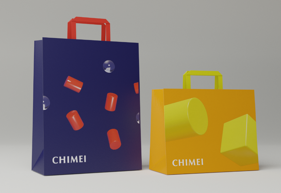
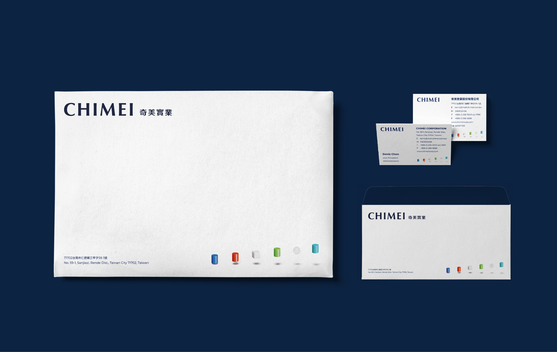
Energetic, Positive, and Colorful
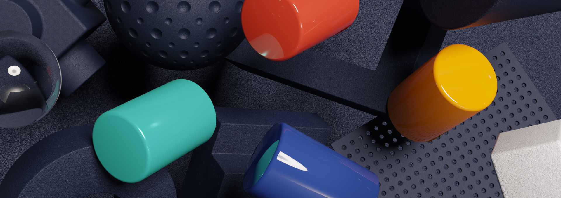
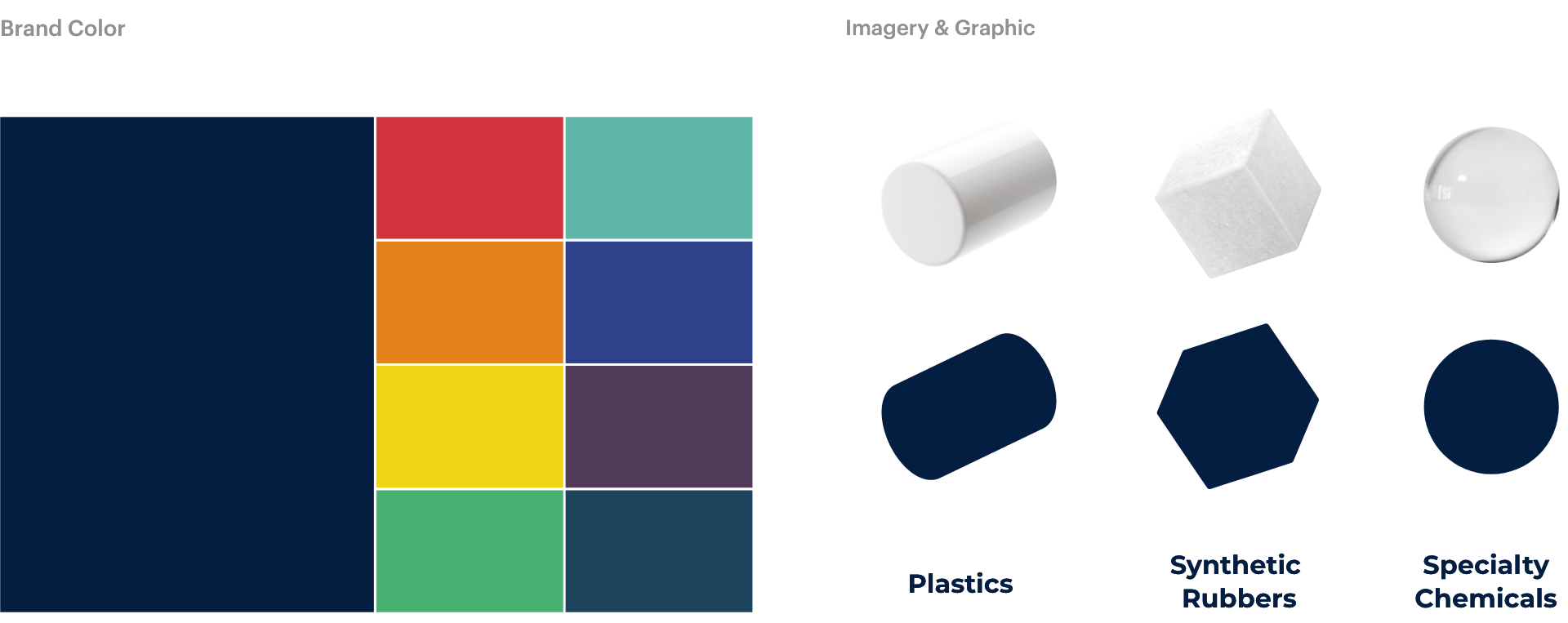
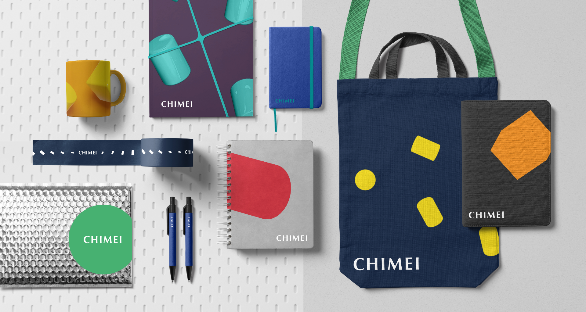
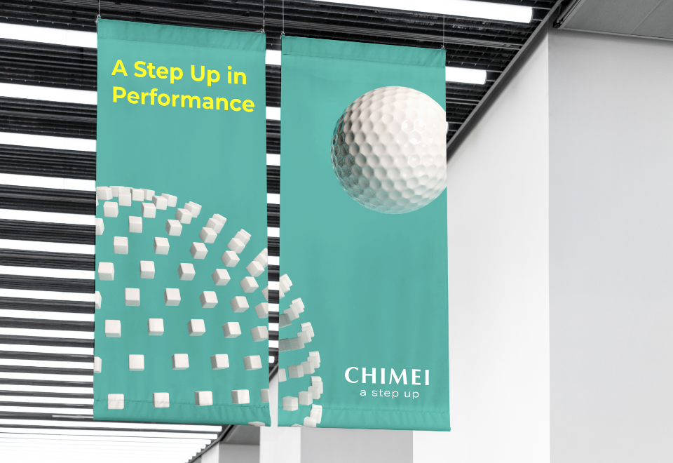
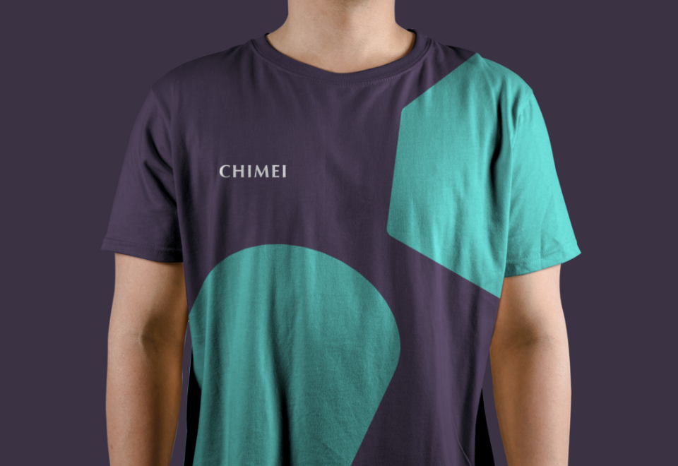
Directly inspired by CHIMEI’s performance materials, and aligning with the brand communication strategy, DDG developed a bold, new visual identity for the company. We refreshed the company's supportive graphics by introducing new 2D and 3D elements, which highlight CHIMEI’s leading product quality and renowned R&D capabilities. We also extended the brand color from a focus on one single dark blue tone to eight different and bold colors, to show CHIMEI’s vitality.
This new and cohesive visual identity system not only prepared CHIMEI for a greater international presence, it also fully demonstrates CHIMEI’s characteristic positivity.

-
Excitement for the Rebrand
The launch of the rebrand won overwhelmingly positive feedback from CHIMEI’s global customers, and provided renewed motivation and pride among employees. CHIMEI has established a brand management office to continue implementing all the changes. With its new, global-facing brand, CHIMEI is now ready for its next phase.
"Branding is an important strategy to build consensus. With the guidance of a professional consulting team, and full internal commitment, we can build up CHIMEI’s energy to face our global competition."
— Shi Xian Chen, Vice President of CHIMEI

-
-
FIND US
- +886 2 2311 7007
- [email protected]
- No. 107, Sec. 1, Hankou St., Taipei 100
-
FOLLOW US
-

© 1994-2024 DDG, LLC. All Rights Reserved.